
Call to Action — How to Improve Conversion Rates with CTAs
Unlock the power of effective CTAs! Dive into the intricacies of website calls to action and discover how they bridge marketing and UX. Learn best practices, the psychology behind color choices, and real-world statistics that prove their impact on conversion rates. Ready to optimize your CTAs for maximum results? Let's get started!
Your website’s calls to action are a fickle element of digital marketing. They’re the bridge between marketing and UX. They are a small, often overlooked element of a website that significantly impacts how well that site meets its goals.
In this article, we’ll take a closer look at CTAs, how and why they impact your site, and look at some best practices to ensure that they do their job well. Let’s dive in!
What Does ‘Call To Action’ Mean?
In marketing terms, a call to action is a button or copy that requests someone to do something. It’s the next step in a journey. That ‘something’ is, more often than not, clicking somewhere, like a button or a link.
A call to action can be as direct as a button that says ‘Buy Now’, or something as enticing as text that says ‘Read More’.
Impact of CTA on Conversion Rate
The CTA (Call to Action) significantly impacts conversion rates. Here are some statistics prepared by HubSpot that confirm this:
- A certain conversion optimization consultant increased the conversion rate of a landing page by 304% by changing the position of the CTA button!
- PartnerStack increased its conversion rate by nearly 112% after changing the CTA content on its main page from "Book a demo" to "Start now."
- According to VWO, a call to action surrounded by fewer elements and more white space can increase the conversion rate by 232%.
Clear and prominently marked call to actions are essential. The content and its surroundings also play a significant role. Below you’ll find a comparison of two sample CTA buttons as a comparison.

What differences did you notice? The first button immediately catches the eye, right? The second one, however, is barely visible and essentially illegible. The message form in the first one is also better fitted to the context.
How to Create a Good CTA and Improve Existing Ones?
As mentioned earlier, CTA and conversion rate go hand in hand. Many ready-made website templates or website builders offer well-designed CTAs and features, but this often translates only to an acceptable conversion rate — and we want to achieve an excellent conversion rate!
Therefore, it's essential to implement personalized and optimized CTAs tailored to the specifics of a particular website and user preferences. Experimenting with different CTA versions, adjusting content, colors, placement, and button sizes can significantly improve conversion effectiveness.
A/B tests are essentially the only truly effective way to determine which call to action works best for you. Despite this, several CTA elements influence conversion, and we can determine how, in principle, they should look. Let's discuss them now.
CTA color
The right color choice can significantly influence user attention, evoke the right emotions, and effectively encourage clicks.
What should you pay attention to?
- Contrast. A contrasting CTA color will stand out on the page, attracting users' eyes and directing their attention toward the button.
- Consistency with branding. The CTA color should align with the brand's visual identity to maintain consistency and stylistic unity on the website.
- Evoking the right emotions. Each color affects us slightly differently. Various publications indicate that each color has its unique impact on human psychology.
For example, red is often associated with action and can evoke a sense of urgency or activate the impulse to click. It's an excellent choice if you want to increase conversion rate in an online store or sales campaign.
On the other hand, green is associated with positive feelings, such as hope or calm. Using it in a CTA can be beneficial if you want to encourage users to subscribe, sign up for a newsletter, or continue reading.
Button placement
In general, avoiding placing multiple CTAs next to each other is advisable. That's what the theory says. However, statistics indicate that one CTA on a scrolling page might be insufficient.
Pages that place a CTA button in the above the fold section and additional call to action lower on the page achieve up to 220% higher conversion rates than pages with only one CTA at the top. It's worth strategically placing buttons in different locations to encourage users to take action at various scrolling points.
While there's no one-size-fits-all location for CTAs, they are typically placed in one of these areas:
- Above the fold. This is the part of the page immediately visible without scrolling. Placing the main CTA here quickly grabs users' attention and prompts them to act before exploring the entire page content.
- Placing the CTA directly below a product presentation or graphic allows potential customers to take immediate action.
- A call to action at the bottom of the page can effectively encourage users who have read the entire content and want to take action or learn more.
- A CTA button in the main navigation menu can be useful, especially if it's a key element the site relies on.
- A pop-up window with a CTA can effectively grab users' attention and prompt a specific action.
Read also: How to Improve Ecommerce Conversion Rates? 20 Proven Strategies
Background and surrounding elements
Less is more in the world of web design. Overly patterned backgrounds make pages seem smaller, and elements appear closer together.
Adequate white space around the CTA directs the user's attention to that button and clearly indicates their next step. Use heat maps to understand where your site's users move their cursor. If you notice many users hovering over white space, consider placing the CTA there.
As a rule, CTAs placed right below images and graphics also convert very well.
The text you place on a CTA
Many CTA optimizations focus on the "call" part of the "call to action," with little attention paid to the "action" part. Yet, the action you want the user to take has a significant impact on the CTA's effectiveness.
Before asking the user to take any action, you must clearly convey what you expect from them and what they can anticipate after clicking the button.
It's crucial for the CTA to be placed in the right context, and for more complex interactions, it's worth enriching them with additional information. For example, a "grab the discount" button in a newsletter might be confusing and disorienting if not preceded by a sentence informing that a discount is offered for the next purchase today.
What else should you remember? "Click here" is not a good CTA text. Good text shouldn't sound like ad copy. Your call to action should sound like the reader's thought.
In short, the call to action content should be clear and straightforward. The CTA text should harmonize with the rest of the content on your site, be short, dynamic, and on point.
Read also: 7 Simple Things To Do To Make Your Conversion Grow
How CallPage Effectively Uses CTAs
CTA buttons are especially important in forms and pop-up windows aimed at lead generation.
CallPage’s widget allows businesses and entrepreneurs to easily and effectively interact with users visiting their websites. Its primary goal is to prompt the user to leave their phone number to receive an automatic call from a consultant in no more than 28 seconds.
READ ALSO: What Is Click-to-Call Software? Check Our Ultimate Guide!
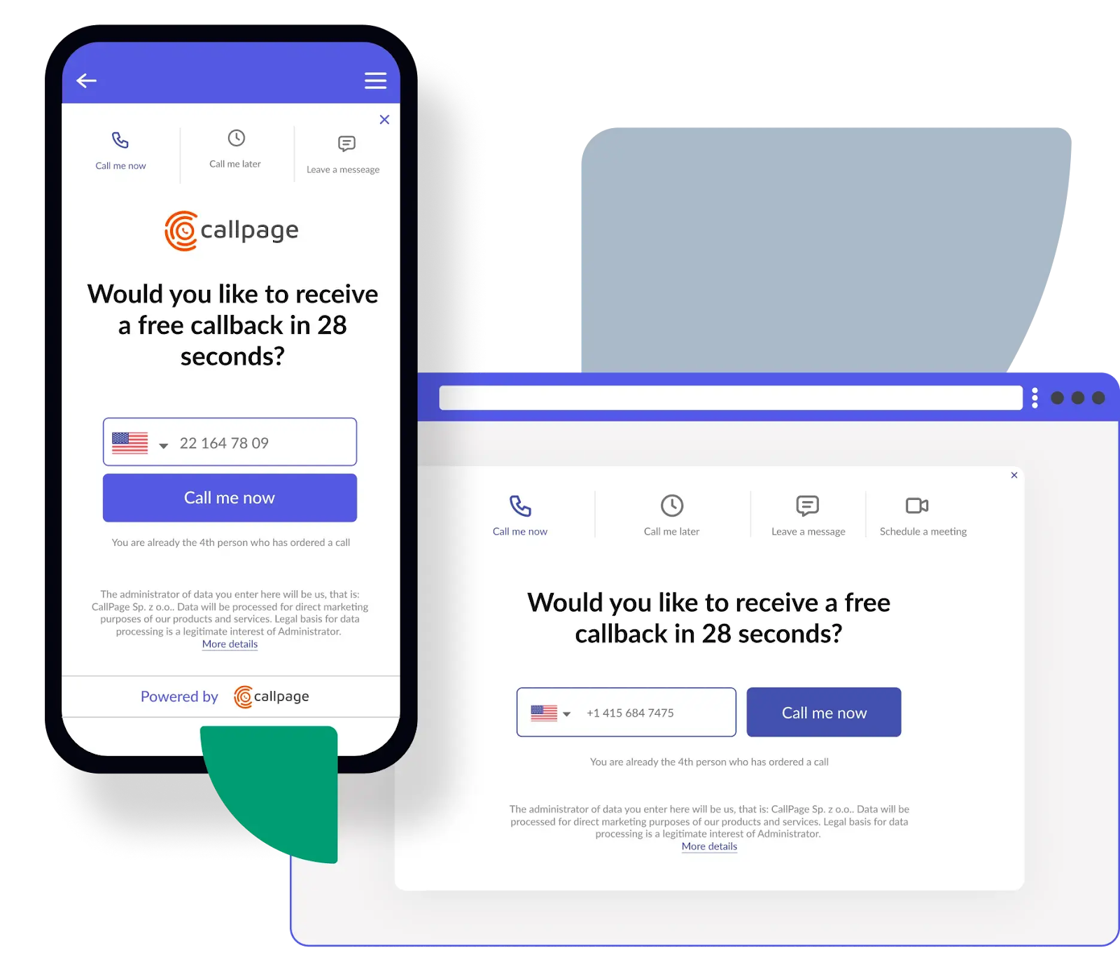
Here's why the call to action in CallPage widgets is so effective:
- The default CTA text is designed persuasively. Instead of the usual "Contact us", CallPage uses a more persuasive phrase: "Call me now". Such text expresses what the user is likely thinking and stimulates a sense of urgency.
- Both the button and the entire CallPage widget catch the eye, thanks to its proper placement on the page, the use of contrasting colors, and aesthetic appearance. Visibility and aesthetics attract users' attention, increasing the chances of them responding to the CTA.
- The CTA in CallPage widgets is simple and devoid of elements that distract the user's attention. They focus on one specific action, making it easier for users to decide and respond to the CTA.
- CallPage offers the possibility to personalize the appearance and content of the widget and the CTA, allowing it to be tailored to individual needs and the brand's style. Personalization strengthens the connection with users and encourages activity.
- CallPage contact widget with a blue call to action (CTA).
Summary
In conclusion, the CTA is a key element of effective marketing communication that is worth optimizing to improve conversion rates and website effectiveness. Attention to color, placement, content, and aesthetics of the CTA can significantly influence the success of campaigns and the achievement of business goals.
If you're interested in improving conversion rates and generating more leads, be sure to check out what the CallPage platform has to offer!
Check out other posts
Start generating leads today!
Start a 14-day free trial now,
set up the widget on your site, and see how many more leads you can capture with CallPage
- No credit card required
- 10 minutes set up
- 14 days fully-features free trial